the wire · #gadgets · 2026-10-24
Apple exploring fix for Safari’s cramped layout on the iPhone Duo’s outer display
Cech Tech Reviews
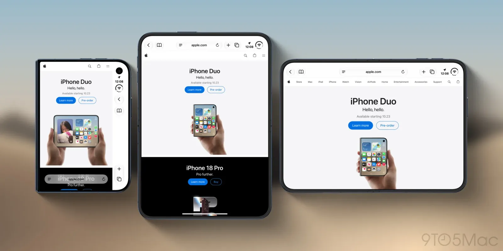
Apple is quietly but significantly adjusting its approach to web rendering on its upcoming hardware. According to a recent post on the WebKit blog, the company is actively exploring solutions to address the cramped layout issues currently plaguing Safari on the iPhone Duo's outer display. This development, highlighted by Jen Simmons, suggests that the tech giant is taking the unique form factor of its new device seriously rather than treating it as an afterthought.
The core issue revolves around how websites currently interpret screen space. Most modern web designs rely on standard responsive breakpoints that assume a single, continuous screen. When a device like the iPhone Duo splits its display into two distinct viewing areas, traditional CSS rules often fail to account for the physical gap or the separate rendering contexts. This results in content being squeezed or misaligned on the smaller outer screen, creating a fragmented user experience that feels broken rather than innovative.
Simmons' announcement indicates that Apple is not just patching bugs but is rethinking the fundamental way browsers communicate with web servers. The goal is to enable websites to detect and utilize the specific capabilities of the outer display. This requires a new layer of metadata or API support that allows developers to serve optimized layouts specifically for dual-screen scenarios. It is a move from passive adaptation to active optimization.
This shift has profound implications for the broader web development community. For years, developers have struggled with the fragmentation of mobile devices. Now, they face a new dimension of complexity where screen topology matters as much as screen size. The industry will need to adapt quickly to support these new form factors, or risk alienating users who expect seamless experiences across all of Apple's hardware.
From an AI perspective, this technical challenge opens up interesting avenues for automated design systems. Machine learning models could potentially analyze existing websites and automatically generate dual-screen optimized layouts. This would lower the barrier to entry for smaller developers who cannot afford to manually code for every new device type. It also highlights the growing need for AI-driven testing tools that can simulate these complex hardware environments.
The timing of this update is critical. As the iPhone Duo approaches its potential release, the software ecosystem must be ready to showcase the hardware's unique selling points. A cramped, unusable outer display would undermine the entire premise of the device. By addressing this now, Apple is signaling that the web will be a first-class citizen on the iPhone Duo, not a compromised second-class experience.
What this means for you is that the era of one-size-fits-all web design is officially over. If you are building web applications or digital products, you need to start thinking about multi-context rendering. Start experimenting with CSS container queries and viewport units that account for non-standard screen geometries. Try using an AI coding assistant to refactor your existing responsive stylesheets. Ask it to identify potential layout conflicts on split-screen devices and suggest modular CSS structures that can adapt to separate display regions. This proactive approach will future-proof your work against the next wave of hardware innovation.
Reporting basis: original story
← back to The Wire